Color Scheming with Javascript
In this post, I’ll share my Javascript code for manipuating colors.
I started a few months back with basic color manipulation routes. Other libraries take a strictly object-oriented approach. This can be a little heavyweight, as it requires explicit conversions throughout the calling code. But in the HTML DOM, colors are generally expressed as hex strings, and if we have routines were built around these, they would be simpler to use. Plus, Javascript is dynamic language, so a String could have color manipulation methods. That’s exactly what I did:
'#fff'.toHexColor()
    => '#ffffff'
'black'.toHexColor() => '#000000''#123456'.toHexColor() => '#123456' (no op)colorString.toRGB() => array of numbers [0..255]-
colorString.toHSL() => array of numbers
    [[0..360],[0-100],[0-100]]
These building blocks aren’t that exciting, but are very helpful to build color manipulation functions on: "#ab342c".darken(%)– make color darker by given percent"#ab342c".lighten(%)– make color lighter by given percent-
"#ab342c".saturate(%)– make color more saturated by given percent. To desaturate, use negative values for the percent. Note that"#ab342c".saturate(-100)renders in grayscale. Generating new colors
Sometimes, you just need a color to get you started: ColorFactory.random() // a random color, somewhat evenly distributed.ColorFactory.randomGray() // a random gray scale value.ColorFactory.randomHue() // given a saturation and lightness returns a random color.or primary and secondary color schemes:

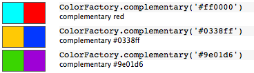
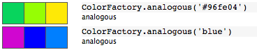
Basic color theory includes the concepts of complementary and analogous colors, so they are provided:
And there is a generic “interpolation” beween two colors. It works interpolating hues, saturation or lightness:

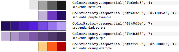
Generating Schemes for Visualizations
Now that we have all the building blocks, we can start building schemes for specific purposes. (Schemes get applied in specific ways). For example, if colors are used to represent a quantitative range of values, the colors must visually read as such. The most straightforward way to do this is to linearly lay them out in a monochromatic scheme. Your eye can read “that value is more than that value” because of the visual relationship, in either saturation or lightness.
This differs from qualitatively distinct values (such as states on a modern election map), which must be read as distinct, but not qualitatively related. A triadic approach is more appropriate in this case. A viewer should at no point be enticed into imaging a “red” state is more or less of something than a “blue” state– they are distinct categories.

 Sometimes visualizations include binary, yes/no values. And some data visualizations are about how the values diverge, where values need to read from as quantitatively diverging from a central value. These are challenging to construct so that they read correctly, and cartographers are experts at this.
I’ve in the process of building a set up Javascript functions that support this type of color scheme generation. It’s still a work in progress, but I have found it quite valuable. I’m curious if others find this useful.